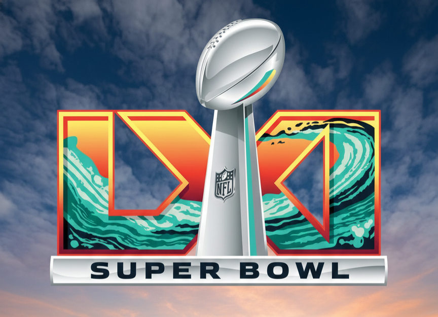

The Super Bowl LXI logo has officially been unveiled by the National Football League — and unlike previous years that leaned heavily on metallic, monochrome numerals, this design makes a deliberate visual statement.
A Sunset-Inspired Color Direction
The 2027 mark embraces a vivid West Coast aesthetic. Dominant shades of orange and warm red blend into sea-foam green waves, creating a layered gradient effect that immediately evokes a Pacific sunset. The Lombardi Trophy remains centered, anchoring the design with a polished silver contrast against the vibrant background.
This isn’t random color selection. In recent seasons, the NFL has shifted away from the long-running silver-and-chrome template introduced in the 2010s. Instead, the league now integrates visual elements that reflect the host region’s atmosphere and cultural identity. For Super Bowl LXI, that means drawing from Southern California’s coastal scenery and evening skyline tones.
Designed for Location and Brand Impact
Set to be played at SoFi Stadium in Inglewood, California, the game’s branding clearly mirrors its surroundings. The warm gradients suggest sunset over the Pacific, while the green wave patterns subtly nod to ocean movement. The result is a logo that feels geographically intentional rather than stylistically generic.
Speculation about “hidden messages” in Super Bowl color schemes surfaces every year, but historically there’s no verified evidence that logo palettes hint at participating teams. The NFL’s design process is branding-driven — focused on marketability, host-city storytelling, and broadcast appeal.
A Clear Shift From the Past
Compared to earlier minimalist iterations, the Super Bowl LXI logo signals a continued move toward expressive, location-based design. It’s bold, television-friendly, and instantly recognizable — three traits that matter far more for league branding than conspiracy theories ever will.
Whether fans read deeper into the colors or not, the 2027 design succeeds in one critical way: it feels tied to place, moment, and spectacle — exactly what the Super Bowl brand is meant to represent.



[…] Read about Superbowl Colors […]