Read about Superbowl Colors
Every year it’s the same playbook: the Super Bowl logo drops, and suddenly half of social media acts like it’s a coded message predicting the championship matchup.
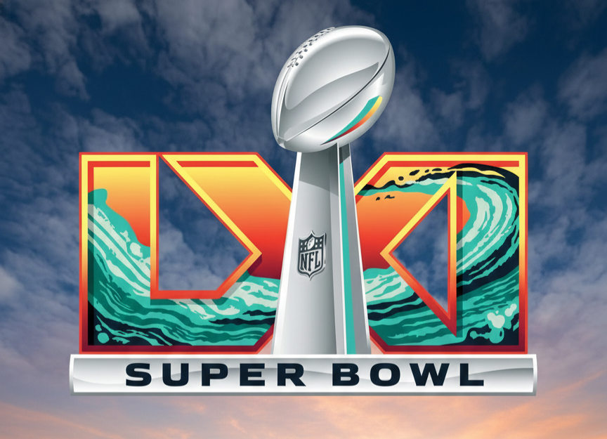
This time is no different.
As soon as the 2027 logo hit screens — with its bright orange glow and aqua green sweeps — conspiracy chatter lit up. People started pointing to past logos and saying, “See? The colors match the teams that end up playing!” That’s the heart of this theory: because a few early designs accidentally resembled team colors that later made the big game, fans now treat every logo like a prophecy.
Here’s where logic matters: coincidence doesn’t equal causation. There’s no evidence the NFL picks logo colors to telegraph who’s going to be good. Logos are artistic branding tools, not insider cheat sheets. Designers choose palettes to reflect culture, scenery, and feeling — not playoff brackets.
Still, this theory refuses to die. For some folks, pattern-seeking is half the fun of football season. They’ll match orange to Bengals or green to Dolphins and spin it into a “prediction.” That’s not strategy or insight — it’s wishful thinking wrapped in optimism and overconfidence.
The real takeaway? Fans love a good narrative, especially when the sport itself is unpredictable. So keep the theories coming if it makes the season more fun, just don’t bet the house on them.